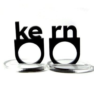
For the typographic nerds in us...
As much as I love this, it does in fact bother me that there is too much space between the "e" and "r"... I mean really? If you're going to make a "kern" ring, shouldn't the kerning uh, be correct? I'm just saying.
For those of you that must have this, click here.


No comments:
Post a Comment