Showing posts with label design. Show all posts

349 : type calendar


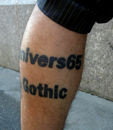
Coolest calendar ever. A different font every day of 2011? I think I need to order me one of these. Although I have a strange suspicion that it'll cause my font "wish-list" to grow. Which may or may not be a bad thing :)

341 : distressed signage

I love photography. Taking pictures soothes my soul. I've already talked about my love for photographing rust and spider webs in this blog, but I've also really gotten into photographing distressed signage (Big shocker, I know). There's something about paint chipping off letters, and (another shocker) rusty letters that makes my heart happy.

334 : wrapping presents

I'm sure by now you may have touched on the fact that I can be a little neurotic in my quest for perfection during the holidays. What's funny, is as much as I like shopping for loved loves, I like wrapping presents even more.

My mom doesn't understand why I'd buy wrapping paper when she has tons of rolls in her garage (snowmen and Santa printed, no doubt) and I'm sure Jeff thought I was nuts when I took forever picking out the perfect paper. But in the end, my neurosis paid off... super cute presents now fill the living room.

322 : linotype : the film


You have no idea how bad I want to see this... Hurry up and come out already!

286 : body type

I have no plans of ever getting a tattoo, but I think some of the reasoning behind getting a tattoo can be rather interesting. Being the lover of typography that I am, this book titled, Body Type by Ina Saltz, caught my attention. An entire book (with a Body Type 2) dedicated to typographic tattoos and the reasoning behind each tattoo. I've seen the ampersand done numerous times, and it's a pretty graphic, I'll give them that, but tattooing the name of a typeface on your arm? Now that's just ridiculous.
Check out the website to find out more.

279 : good fucking design advice


Today I stumbled upon the website, goodfuckingdesignadvice.com. Yes, I know it's kinda harsh, but that is what makes it's funny... its blatant, no nonsense statements related to design (ironically, I got the one above about Comic Sans). And the site is full of advice. Each time you visit the site (or click the button for more advice), you'll be taken to a new statement.

Offended by the use of the f-bomb? You're in luck. There's a family friendly version...

276 : house industries fish

For the past few years House Industries has been full of fun and interesting objects and type; many of which have been talked about on this very blog. Well, they seem to be doing it again. These wooden fish are super cool and oh-so minimal.

275 : flow charts

I like things neatly organized, and I'm also a terrible decision maker. Maybe that's why I find flowcharts so interesting. Some of them have so much thought put into them, it's pretty amazing; and some are just plain comical. And although I like the way they look and the organization and thought process that goes into it, do I think you should use a chart to make decisions....absolutely not.
 
I'd say, if you even need to ask whether you can date a person or not, the answer is probably "no". But hey, that's just me.

271 : design events


Events geared toward designers are always fun and interesting. Tonight was the Sappi paper event featuring their new Standard guide. It's kind of amazing to see the lengths companies go to to get us to use their paper, or print with their company. Not that I'm complaining. What designer wouldn't like to mingle with fellow designers, snack on yummy food, drink some booze (they ran out of tequila 20 minutes after the start if the event) AND get to walk away with some paper samples? Plus, the new book on folding is super fun.

270 : type memory

Some of you may be thinking that this is yet another typography post... and you're right. But this was just too cool to pass up: a typography memory game. No longer are you matching barn animals or cartoon characters; this set of memory is for the serious type lover. The game includes 25 different typefaces including Akzidenz Grotesk, Baskerville, Centaur, Garamond, Helvetica Rockwell, Times New Roman, Univers and many more. So cool.

To get your own set click here.

269 : moonstruck packaging

I'm definitely a minimalist girl. Clean, modern lines, and tons of negative space makes me one happy girl. But occasionally, I'll see something elaborate that speaks to me. The newly designed chocolate bar packaging for Moonstruck was designed by typographer Kate Forrester, is one of those things. Love the hand-drawn lettering and drawings. So pretty.

268 : ampersand tote

I love these ampersand totes. In the time of everyone going green, and bringing their own reusable bags, these bags are way more me than the traditional ones found in the stores. Funky fonts and bright colors make them scream "type nerd" and that, my friends, is a title I wear proudly.

267 : elix vase

I'm a bit of a vase whore. I love them and I love the Elix vase by Pol Quadens. The spiral holds the stems in place and the base holds the water. So beautiful.

262 : bare essentials for the graphic designer

This poster by gridlondon.com cracked me up today. But more than just a humorous take on the profession I love so much, I realized just how true a lot of this was...and luckily how many of these things I actually posses (if I do say so myself). Would love to have this on my wall (although I'm not really a "posters on the wall" kinda girl, and the underline under the title bugs me...come to think if it, scratch that about putting it on the wall) I would however, love to know why a gun made the list...I know my office can be (shall we say) colorful, but a gun, really? I think I'll do without that one.

258 : the geometry of pasta


I came across this book today and am seriously in love. A book about pasta and sauces? Eh. But the simple, beautiful design and graphics of the book may just qualify it as shelf worthy. The flat black graphics are just so beautifully done, and I LOVE the alphabet page (big shocker there). Gorgeous.

255 : spinning tops

I've had a bit of a fascination with spinning tops since I saw the short films by Charles and Ray Eames, and I'm sure many many more people now have the same fascination with them after watching the Leo DiCaprio movie, Inception. In my head I always picture the traditional shapes and colors, but seeing the ones in the above photo have shown me just how truly amazing these tiny little things can be. 

Photo from http://www.notcot.com/archives/2010/04/german-spinning-tops.php

249 : welovetypography.com

When I have the desire (which is often) to look at beautiful typography, I head over to welovetypography.com. A compilation of various images of type from all over the web, this site definitely feeds my need for visual stimulation.

245 : colombo tea & coffee packaging


Love the packaging and logo designs from Colombo Tea and Coffee, a South African based company. The clean, white packaging showcases the beautiful "coffee" stained logos perfectly.

239 : house industries

Over the past few years, I've become seriously obsessed with House Industries. Not only do they have some amazing fonts (Day 191) but they've come out with some crazy beautiful products. In addition to the Alexander Girard blocks from Day 16, there are also these beauties:

Between the Girard alphabet blocks and this set, I know no regular ol' blocks are gonna cut it for my future kids.

And how seriously amazing is this Girard memory game. Love it.