

A mini experiment asking ourselves each day "What makes me happy?". From the big things to the little things and everything in between. This year long conversation about anything and everything, began 01.10.10 and will end 01.09.11.
Showing posts with label typography. Show all posts
Showing posts with label typography. Show all posts
360 : my collection


349 : type calendar

Coolest calendar ever. A different font every day of 2011? I think I need to order me one of these. Although I have a strange suspicion that it'll cause my font "wish-list" to grow. Which may or may not be a bad thing :)

341 : distressed signage


340 : ampersand finds

334 : wrapping presents

My mom doesn't understand why I'd buy wrapping paper when she has tons of rolls in her garage (snowmen and Santa printed, no doubt) and I'm sure Jeff thought I was nuts when I took forever picking out the perfect paper. But in the end, my neurosis paid off... super cute presents now fill the living room.
333 : letter ornaments

This year, I found some amazing metal letters from Restoration Hardware to adorn my tree. Who knew little metal letters could make a girl so happy. If only they had ampersands...

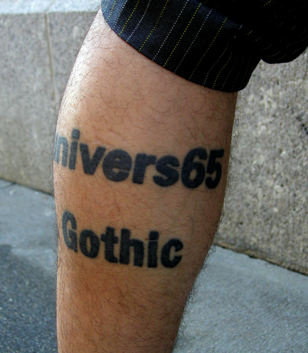
286 : body type

279 : good fucking design advice

Today I stumbled upon the website, goodfuckingdesignadvice.com. Yes, I know it's kinda harsh, but that is what makes it's funny... its blatant, no nonsense statements related to design (ironically, I got the one above about Comic Sans). And the site is full of advice. Each time you visit the site (or click the button for more advice), you'll be taken to a new statement.
Offended by the use of the f-bomb? You're in luck. There's a family friendly version...

277 : comic sans (gasp!)
Clearly, I'm no stranger to typography. I've posted about it dozens of times on this blog. But today, I feel compelled to post about the black sheep of fonts, Comic Sans.
I really like what Tom Fauls has to say about Comic Sans in the above video. I do however disagree with the argument that it's not a well designed font because the default kerning is bad. Um, we're designers, people, we shouldn't be dependent on default kerning anyway. And it's overused? Seriously? What about Helvetica? Should we all hate that because you can't drive down the street without seeing it? I think not.
While I get the majority of the design world absolutely despises the font, I think it's ironic that one single font can't cause so much negative emotion in people. Love it, or hate it, I really don't care. Comic Sans has it's place in the world, just like every other typeface out there. I really don't see the sense in devoting so much time and energy into hating something that you have no control over. Don't want to see CS? Then don't use it.
"Good typography should be like a wonderful, clear crystal goblet that holds wine. Much better than a golden goblet, with jewels on the outside. Because the point of the crystal goblet is that you can see the wine on the inside; you can appreciate the colors of it." Tom Fauls
I completely agree. And if you can do this and use Comic Sans...well, the more power to you.
I did however, get a laugh out of this...

I really like what Tom Fauls has to say about Comic Sans in the above video. I do however disagree with the argument that it's not a well designed font because the default kerning is bad. Um, we're designers, people, we shouldn't be dependent on default kerning anyway. And it's overused? Seriously? What about Helvetica? Should we all hate that because you can't drive down the street without seeing it? I think not.
While I get the majority of the design world absolutely despises the font, I think it's ironic that one single font can't cause so much negative emotion in people. Love it, or hate it, I really don't care. Comic Sans has it's place in the world, just like every other typeface out there. I really don't see the sense in devoting so much time and energy into hating something that you have no control over. Don't want to see CS? Then don't use it.
"Good typography should be like a wonderful, clear crystal goblet that holds wine. Much better than a golden goblet, with jewels on the outside. Because the point of the crystal goblet is that you can see the wine on the inside; you can appreciate the colors of it." Tom Fauls
I completely agree. And if you can do this and use Comic Sans...well, the more power to you.
I did however, get a laugh out of this...

276 : house industries fish


275 : flow charts


I'd say, if you even need to ask whether you can date a person or not, the answer is probably "no". But hey, that's just me.

270 : type memory

To get your own set click here.

268 : ampersand tote

262 : bare essentials for the graphic designer

249 : welovetypography.com


239 : house industries
Over the past few years, I've become seriously obsessed with House Industries. Not only do they have some amazing fonts (Day 191) but they've come out with some crazy beautiful products. In addition to the Alexander Girard blocks from Day 16, there are also these beauties:
 Between the Girard alphabet blocks and this set, I know no regular ol' blocks are gonna cut it for my future kids.
And how seriously amazing is this Girard memory game. Love it.


And how seriously amazing is this Girard memory game. Love it.

Subscribe to:
Posts (Atom)